Role
User Research
Product Strategy
UI Design
Interaction Design
Usability Testing
Tools
Figjam
Notion
Maze
Figma
Dovetail
Timeline
4 weeks
The Problem
Currently, users are not able to create their own groups to share their space/look for spaces, making for a frustrating experience.
The Solution
Identify the best experience for group creation within the app that is familiar to users.
Usability Review
To help me better understand the product, I conducted usability to identify pain points and wow moments in the existing experience
Business & User frustrations
Group creation is not a possibility.
Primary Frustration
When logging into the application users are not given the affordance to create groups which results in a limited user experience.
Secondary Frustration
When navigating through the application users are met with limited clarity of how to use its features which results in a lack of need to use the service.
Competitor Benchmarking
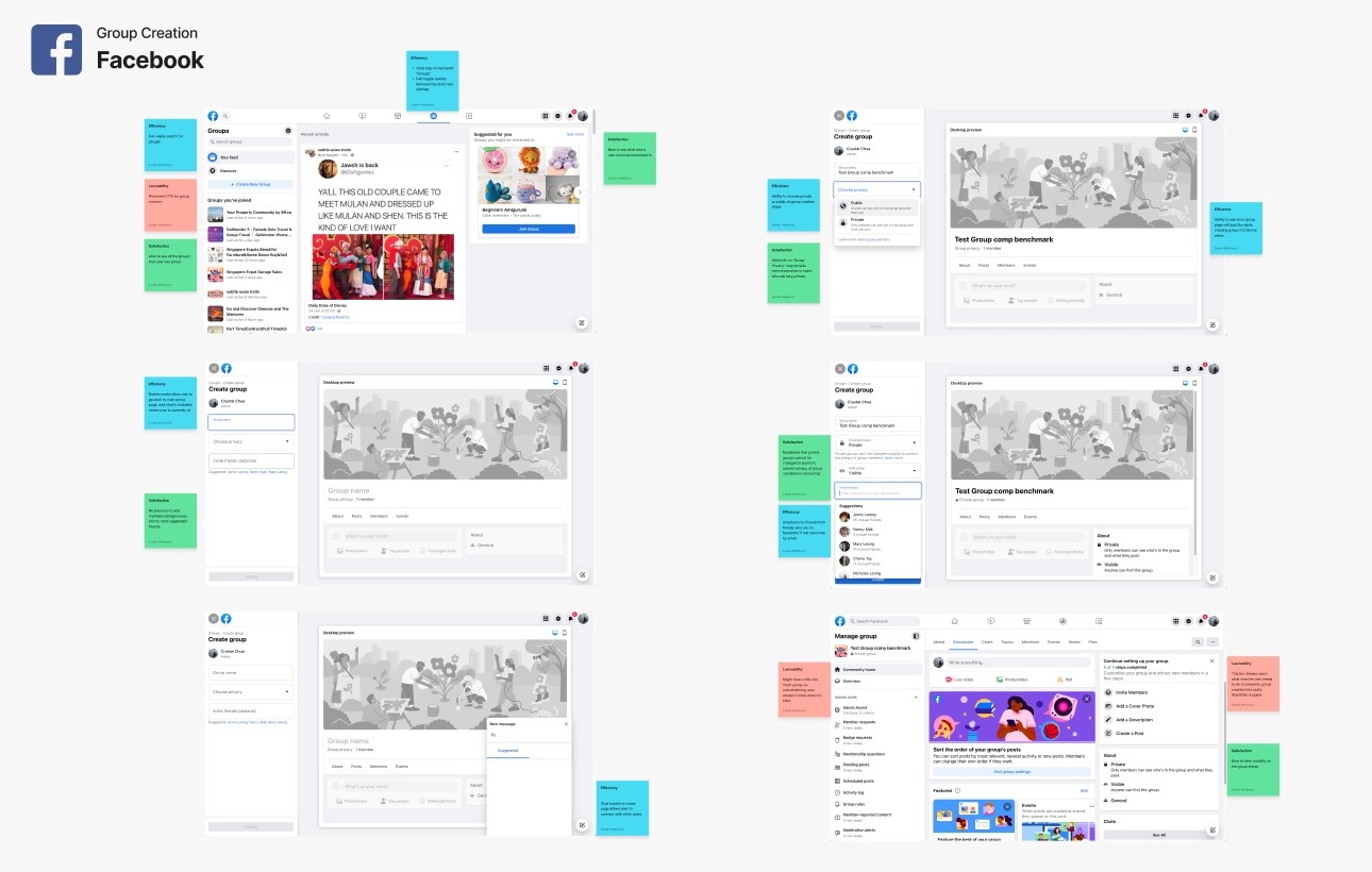
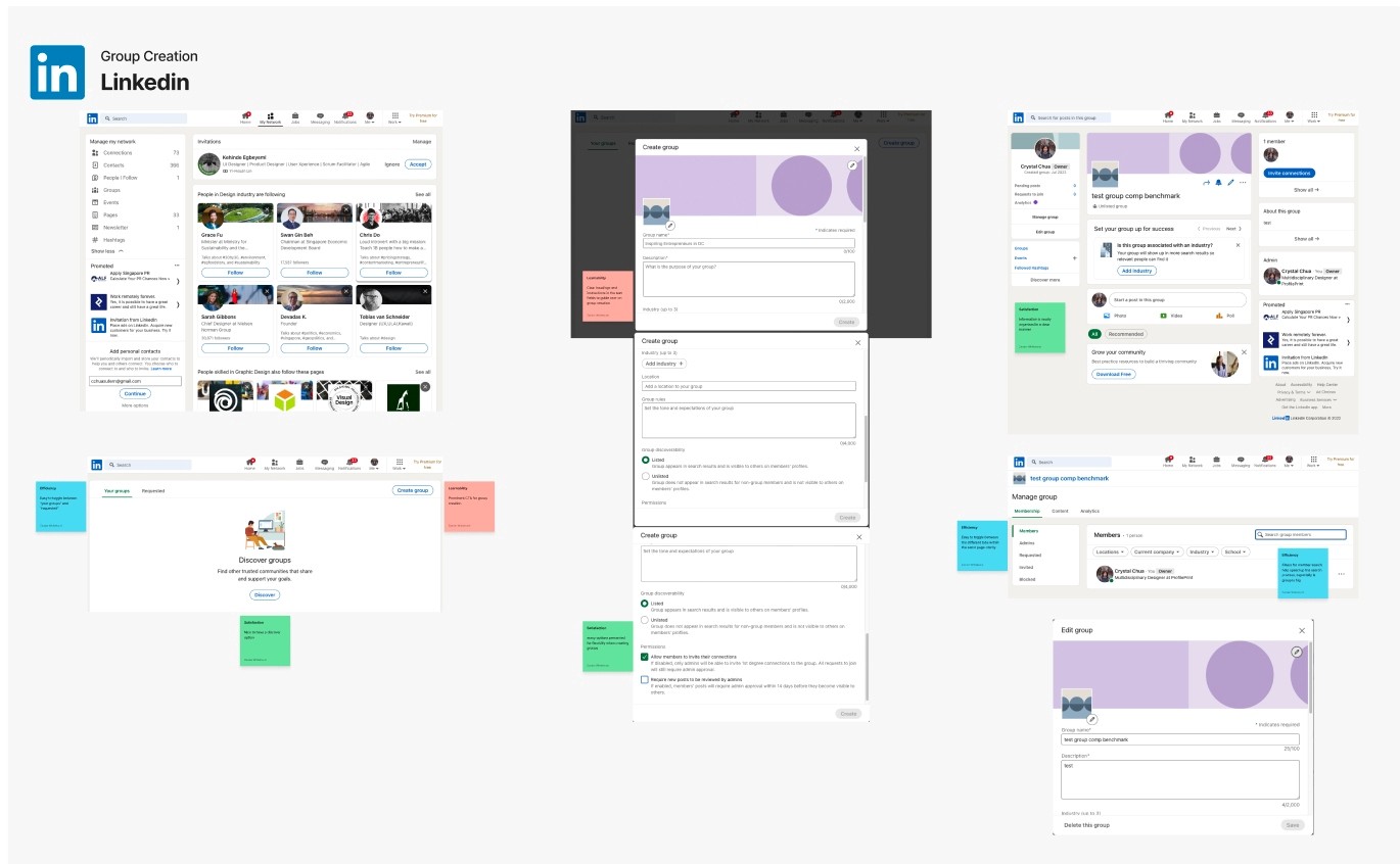
With a usability review complete, I moved on to competitor benchmarking to help me identify standards in competitor products that could be used to improve the existing experience.
Problem Space
How Might We improve inviting friends to MyPlace and provide group creation?
User Interview
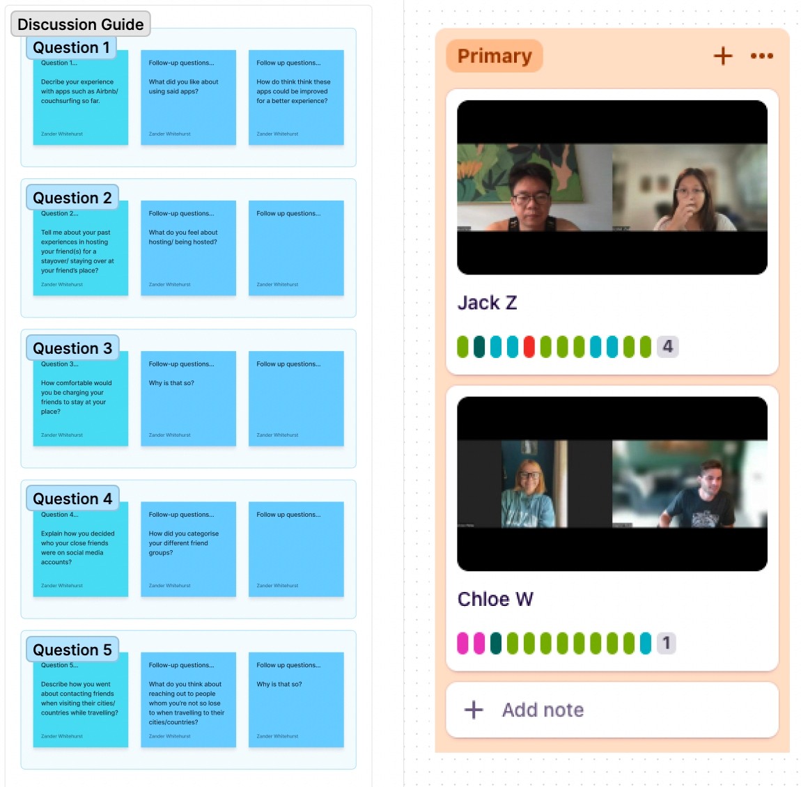
Next, to gain further insight into user's concerns needs and frustrations, I wrote a research plan and interview script then conducted two interviews.
Affinity Map
To validate the initial observations made from the usability review and competitor benchmarking I synthesized interview results from users to identify the key insights they illuminated.
Primary Insight
There are different tier options needed for specific groups in regards to cost or charging.
Secondary Insight
Need a variety of options to reach out to groups of friends or acquaintances.
Ideation
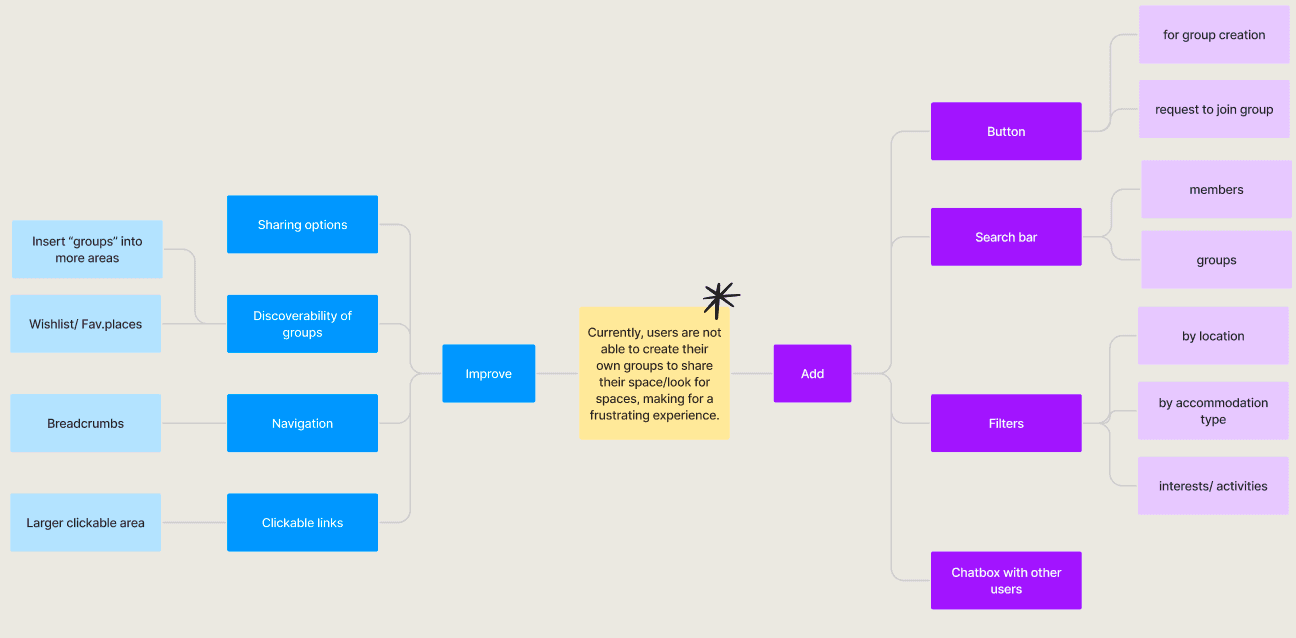
Next with the main problem in focus I utilized mind mapping for ideation.
What can we add
Visibile affordances for group creation.
What can we improve
Discoverability of groups and related IA.
Information Architecture
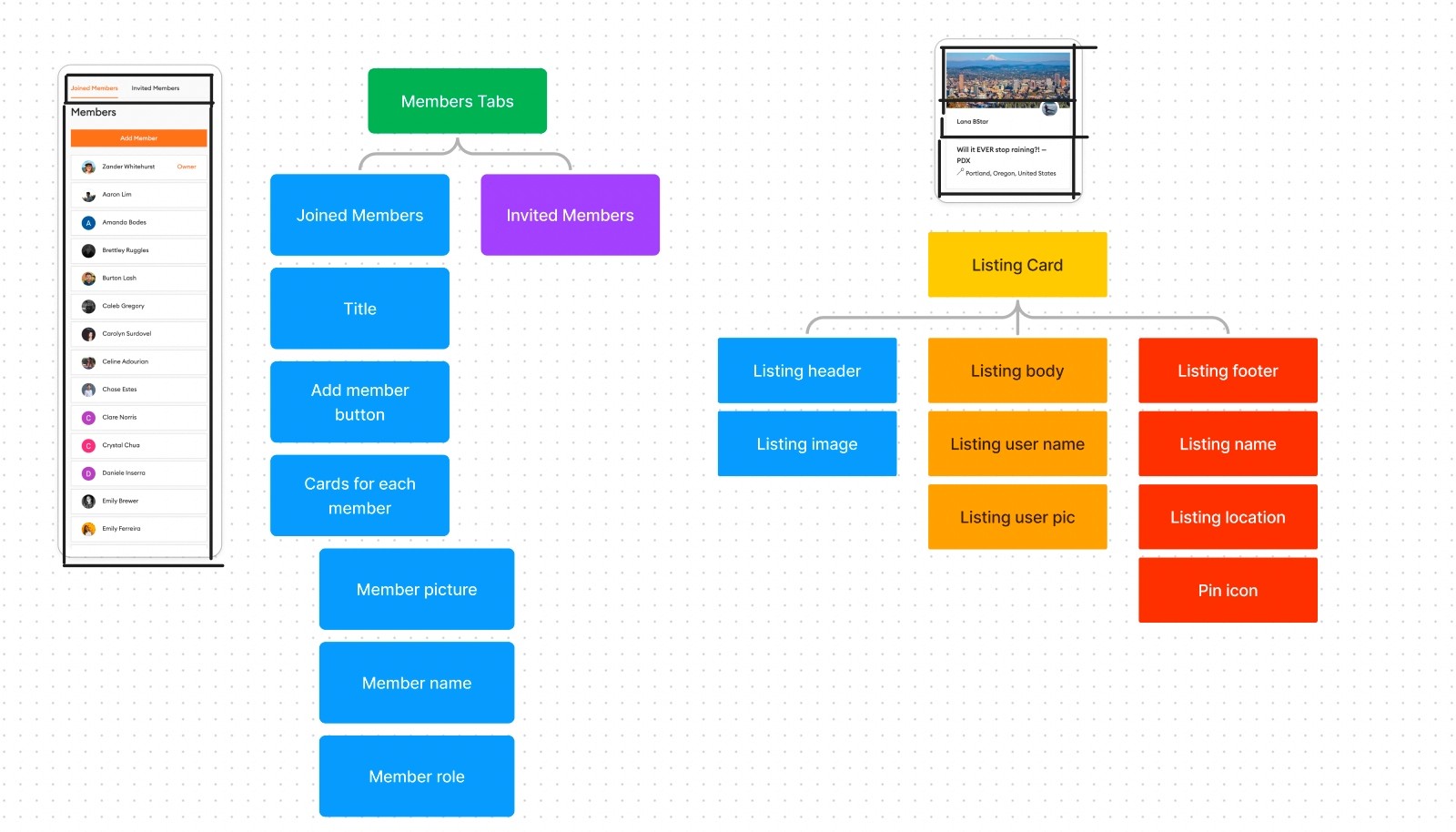
Understanding the problem space led to mapping the information architecture to see how we could improve the hierarchy of content to improve the experience.
User Flows
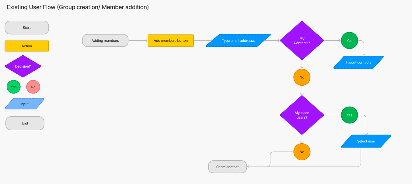
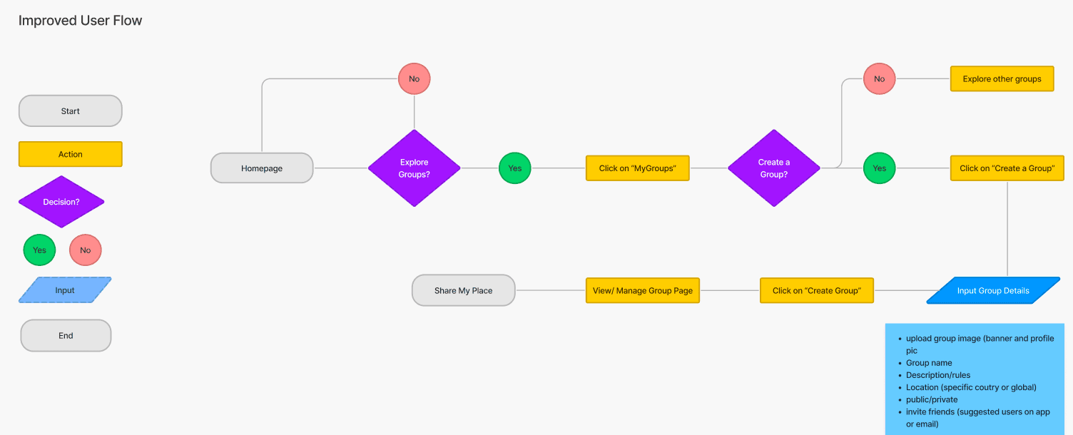
Next I mapped the existing and improved user flows of the product with my top ideas applied.
Rapid Prototyping
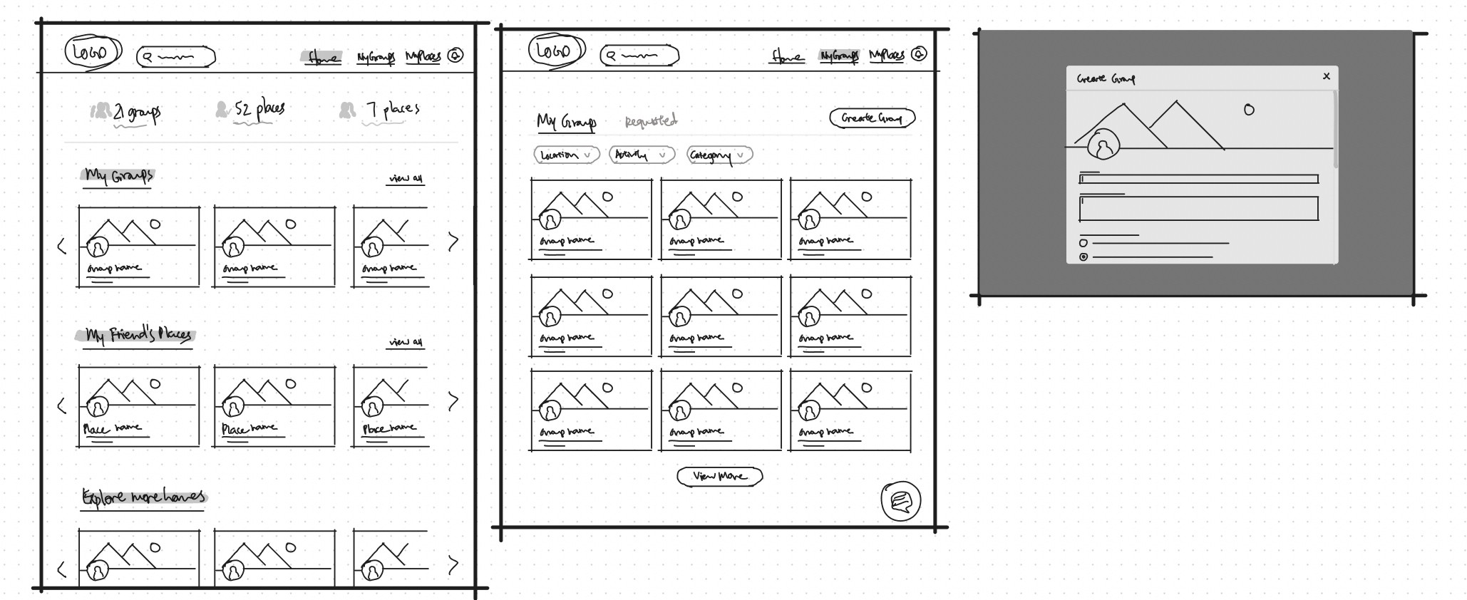
Having mapped an improved user flow I spent time rapidly prototyping a solution. Sketching helped me rapidly iterate on the original idea and visualize a solution without committing too early to high-fidelity screens.
Styles & Components
Before creating the hi-fidelity prototype I defined the product styles and interactive components in Figma to easily and quickly help me design consistently


High Fidelity Prototype
Below is the final version of the prototype that I created. I included interactions and transitions from Figma to match the products flow.
Three key learnings
1. Providing several places for group creation within the product will improve efficiency and learnability for users.
2. Giving users power within security and settings for their groups will help them maintain confidence in their homes privacy.
2. Adding a MyGroups page to the global navigation should help clear any confusion between 'groups' and 'places'.
Next steps
Next I would need to put these designs through usability testing and iterate upon the outcome of those results.

